Which Logo Would You Choose for The Made in America Movement?
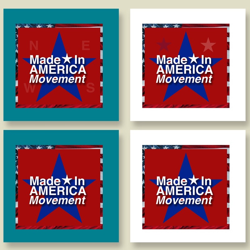
Last week we asked if there was anyone interested in donating their time and/or skills to The Made in America Movement.Santi Acosta from SantiDesign came forward and donated his time. He offered to help us come up with a LOGO for our Facebook page as well as our website.Below are the samples he came up with!
We loved all the sample designs, but could not decide on one.
So we are asking you, our loyal followers!We have created two (2) polls so that you may choose your favorite!
We have our favorites!!! Let’s hear what yours are!
We loved all the sample designs, but could not decide on one.
So we are asking you, our loyal followers!We have created two (2) polls so that you may choose your favorite!
We have our favorites!!! Let’s hear what yours are!
Thank you for all your help, our loyal constituency!!!
Thank you, SantiDesign, for coming to our rescue!
Check out their work. They are amazing at their craft.
—
Polls close Friday, April 13th at midnight. (Yes, folks, Friday the 13th.)
Poll results will be announced Saturday, April 14th in the afternoon.
Please Help The Made in America Movement choose a logo!


the ” MIAM” just don’t do it for me & the ones to the left were only distinguishable to me if viewed ‘very closely’ … I think the one’s on the right pop better on the white background
I like the potential logos, but the remainder of the page really needs some work. It is visually unattractive and very choppy. It could use a mild background and the text in the body of the page looks like it was typed on a typewriter. It needs to flow, rather than be several half sentences and short lines. I stand 100% behind the Made in America movement, with or without changes to the site, but a nicer image and flow would be very nice.
I definitely love the Made In America Movement with the stars behind the logo copy…good job!
Neither one does anything for me. Not enough flag showing on the right.
I agree with Vicky, the top right logo in the left group is my pick. The right group look far to busy and unconnected. Keep it simple and clean for the biggest impact.
Have to add my 2 cents and just say I’m not really a fan of any of them. just not very visually appealing
Don’t like the MIAM logos….. I also liked the top right logo best. Sometimes less is more and that’s the case here.
Nothing but success!
The top right.Two bad the second boxes look too much like Miami-(otherwise great design) MIA would be better-since many American Products are Missing In Action-and over seas!
I agree with Vicky. The MIAM abbreviation doesn’t naturally connect to the America mission. Too abstract. And though the top logos look good against white, the fact that they get lost on a color highlights a weakness. This logo would need some help before it makes it’s way onto printed material.
I do not like any on the right group…It looks like it’s gonna say Miami..Not a good logo. Stick with the ones that clearly say Made In America,
Nice designs and creativity also.